In the past few years UX gained focus targeting simplicity and clarity in the user interaction with the application (mobile and web). The long registration forms have almost disappeared, the office like toolbars are gone and so is the load of unnecessarily information on a single page. The important buttons became larger and more noticeable in order to guide the user for his next action. There is no doubt that these changes improved the user experience with the applications. The absence of this UX principles became a major factor in the user’s consideration for choosing a certain app over another.
Simplicity and clarity became common UX practices along the different apps. The user has a variety of application serving almost the same purpose and he is free to choose whatever he likes. So how could your app be special and become the users favorite choice? The answer is quiet surprising - your app must be fun!
The user should remember the interactions with your app. It should make him smile, it should make him say “wow!” and sometimes it should even make him laugh. If the interaction is special and exciting not only it will make the user to come back it will also make him kindly tell his friends about that “super cool” app that made him laugh and that they must try it too.
Do your users have fun or are they excited when working with your app? Do you have a user story in your backlog with a “should make the user smile” definition of done .Take a look at these 6 ideas:
1. Animations
2. Easter eggs
3. Predict the user actions
4. Gamification
5. Since you’ve been gone
6. Interaction as a relationship
Let’s dive in:
Animations
An animationless app is a boring app! The users expect live interaction, moving objects, flying adds and real life behavior while they are interacting with an application. Take a look at famo.us framework which allows you easily add animations to basic content pages and make them look awesome. Try to imagine how should the page/dialog/alert/form interact then it appears or disappears. Slowly fades away, moves to the right until it’s gone, falls from the top, increases font size, changes color and many more. Don’t push it – be cool.
Easter Eggs
Easter eggs are unexpected behaviors when the user does something in the app.. Take this logo for example:
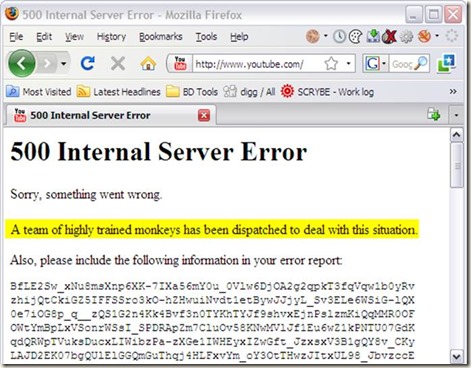
That’s just cool! I found myself spending few minutes watching the dinosaur does “raar” when I hover the logo. It is so easy to create and it will certainly make your user smile. The best Easter eggs I know are actually on Google. Try typing “zerg rush” or “Atari Breakout”. Another possible and pretty cool Easter Egg is the error page. An error page is the worst thing that can happen during the user’s interaction. So we almost ought to make it fun.
Take a look at this site for some crazy ideas.
Predict the user actions
Which app will you prefer? A regular one that just allows you to do stuff on it or a smart one that seems as if it thinks and tries to understand and get to know you? The users want the second one.
Are you familiar with Waze?
When you open the GPS navigation app Waze in the morning it automatically asks if you are driving to work and in the evening whether you are coming back home. That’s just adorable, it’s like it knows me J
Think about the waze (I meant ways) that you could predict your users. If your app allows them to order something then perhaps the next time the user logs in it will automatically redirect him to the order status page and focuses on the user’s order.
Try to make the users think that your app cares about them, tries to learn them and to save them time.
Gamification
Everything is better when a game is involved. It’s human nature to try achieving a goal or a target. To try being the best in a group. So when the users have goals, targets and achievements to unlock they will want to do them. This way you can make them use all your app’s features while you guide them towards some achievement, stay longer online and insure that they’ll come back for more.
You can add levels, prizes and categorize your users. You can present them gifts when they level up or unlock some sort of achievement. Let’s say you want to give some user a coupon or a discount for his next purchase, so why not making then answer a trivia quiz or play a minified version on candy crash inside your app in order to win the discount (you can give it to them even if they lose)?
Linkedin ranks you profile, the more details you add about yourself the higher your rank is.
Since you’ve be gone
Nowadays almost everyone is doing continuous delivery. You add new features and change existing ones on a daily basis. How would the user know that his favorite app has a new feature or better yet how would he know that his favorite feature has changed?
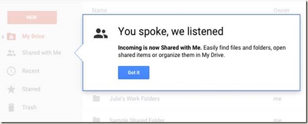
You want to make the user feel comfortable with changes. Take a look once again at Google:
Feels familiar? Google always keeps us updated so that we will never come back to our app and not know how to use it.
Interaction as a relationship
You will always remember the first kiss with your love one, your first date, first vacation and more. They were special. How about making the first interactions with your app special? The first login, first purchase, first comment, the 10th whatever. Make these simple actions meaningful and special. From time to time remind them of those special moments. Your users won’t believe it, they will adore your app and remember it for good. Take facebook’s ”on this day” for example when it reminds us the stuff we did exactly 5 years from now.
Special day in deed.
How does it help your app? It doesn’t. It just makes it special. And that’s what counts.
That’s my six ideas that I think will make your users laugh and smile. I’m sure that there are many more ways to achieve it. Feel free to comment and share your ideas.
Best,
Dennis


Nice!
ReplyDeleteHi nicee reading your post
ReplyDelete