Tuesday, June 30, 2015
Domain Driven Design, CQRS & Event Sourcing
Tuesday, June 16, 2015
Creating Nuget Packages using Visual Studio 2015
Visual Studio 2015 (currently RC) lets you create nuget packages extremely easy!
First create a new Class Library project:

Notice that it is under ‘Web’ category.

Now we’ll enable the nugget package creation just as written in the comments above.

I just love their UX in this window.
Now we’ll need to fill the package details in the project.json file.

The project.json is almost the same as the .nuspec file. We can include the package dependencies and the target frameworks.
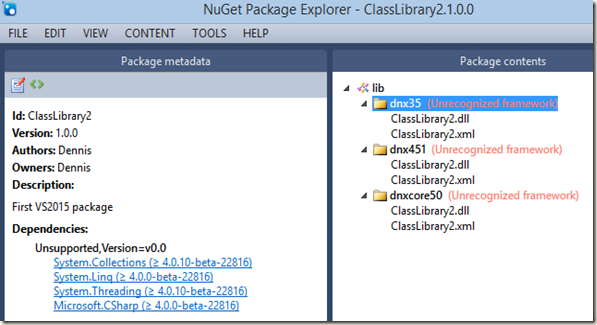
Now if we compile the project and navigate to the solution directory we’ll see the nuget package in the artifacts folder.


Good luck
Friday, June 12, 2015
Aligning Elements using CSS3 “Flex” options
CSS3 introduces the “Flex” options that makes aligning elements extremely easy! It is currently supported in all the major browsers (not supported in IE 11 and below);
Let’s say that I want to align four elements in a line:
The CSS:
.container {
padding: 0;
margin: 0;
list-style: none;
display: flex;
}

.item {
background: green;
padding: 5px;
width: 150px;
height: 150px;
margin: 10px;
line-height: 150px;
color: white;
font-weight: bold;
font-size: 3em;
text-align: center;
-ms-border-radius: 30%;
border-radius: 30%;
}
The only new property here is “display: flex”. Not only that flex aligns the elements in a single line it also makes them responsive when the container size changes (overriding the element’s explicit width property;
If you wish to keep the element’s original width you can add the flex-wrap:wrap property which will break the line if needed:
You can reverse the order of the elements that break the line using flex-wrap:wrap-reverse:
You can align the whole line to center or to the first/last item (flex-start/flex-end) using the justify-content property. By default it is set to flex-start:
.container {
padding: 0;
margin: 0;
list-style: none;
display: flex;
flex-wrap: wrap;
justify-content: center;
}
There are two more options for justify-content: space-between and space-around which adds equal spaces between each element:
.container {
padding: 0;
margin: 0;
list-style: none;
display: flex;
flex-wrap: wrap;
justify-content: space-between;
}
If you choose space-around then the first and the last elements will also have the same spaces from the borders.
Vertical Alignment
You can vertically align the elements using flex-direction:column.
Using align-items you can control the vertical starting point (the same like justify-content):
.container {
padding: 0;
margin: 0;
list-style: none;
display: flex;
flex-wrap: wrap;
align-items: center;
flex-direction: column-reverse;
}
So far we’ve applied the flex properties only to the elements container. We can also apply some flex properties directly on the elements, like making some item be 3 times bigger than the rest:
.container > .grow {
flex-grow: 3;
}
I’m using the flex-grow property on the wanted item and setting it’s value to 3 as for 3 times bigger.
Flex has more properties that can help you easily align your elements . Go ahead and try!

![clip_image002[4] clip_image002[4]](https://blogger.googleusercontent.com/img/b/R29vZ2xl/AVvXsEjPHO8YAn5tvTPxpSFKHTK-VG4LmHChSr937n4KJnwmsJJwQ6Lj4JwXvmuXlRzv8OXIa-Y7dLzYSR-f4Xwga47_Tq1AmtUIvrz0yVO6QIMDWBJpLfm965fPISYer_-g34NFm32a6JQdvtI/?imgmax=800)
![clip_image003[5] clip_image003[5]](https://blogger.googleusercontent.com/img/b/R29vZ2xl/AVvXsEhcXN9jOiEWH7aNi3cKzMF0lKeqZEwU0p2J99c3ZhBc8BhYWUAh-D7_g1tZoSShKzKnqUcpY1C-o_t-jdo5CviuaIYl_-OOpUO9lur53CKiDGAa63g6g_mxLO3402smDhH0_-tO9I1khrQ/?imgmax=800)
![clip_image004[5] clip_image004[5]](https://blogger.googleusercontent.com/img/b/R29vZ2xl/AVvXsEj7aaYl4Cala4Q3facOKOn5lWwy8onBEV_NBzwyZaotX034QlsXVIMj1Z0vfECUBYGgkfTe8q028e-qR2CT_YeBeOZPWIPYvt_2QQd1By-rFIiyj8RFSdWbnZU2PDryUNTti4lXWc0HckI/?imgmax=800)
![clip_image005[5] clip_image005[5]](https://blogger.googleusercontent.com/img/b/R29vZ2xl/AVvXsEjD72oTKl9Kta9B1iZTHk1cDmUNF50HUtqxc8io77UJtxE7a6vGbFVUb1UiZM1h0Pvki_mbqwpZSScQZZjiwJLa9lq14pTwySQJxlbW-ScesTrWuOAO1ZvcQoF4SoXNGVaKSuk0_23KuMQ/?imgmax=800)
![clip_image007[5] clip_image007[5]](https://blogger.googleusercontent.com/img/b/R29vZ2xl/AVvXsEgjZvzMAV-KSgmUIiQYJCRK3xKEkmgAx6B9yUFAMC-HeMKYPBNSxjigNz1aQJ2go8s9Sq0YoXxgRdBpYNZI5AE9qi3qFaH7iYlypKTqS2sw2bhNXvqnw3197fkKHwNn5UQVJ5zW1Jj0r6s/?imgmax=800)
![clip_image009[9] clip_image009[9]](https://blogger.googleusercontent.com/img/b/R29vZ2xl/AVvXsEgGgsP5z_l_fthzJdB6Xz6LgqqpceCSgSm1q5ZGzzJAzWrycDtlNdyJGlKWvghVY_LvlESlkZ2VKX9F4HAZn9uxROeVxqgKQ8GFKBu_5OQxFEOKZhhvEh_n1p6E3JkZVXHTak8MledPKWg/?imgmax=800)
![clip_image010[4] clip_image010[4]](https://blogger.googleusercontent.com/img/b/R29vZ2xl/AVvXsEgGnCFXMICGBI6cg9eMIN6vwePkdH9KuL9j9c5fh0GdhE8cCvpm4Rh7LmkSawhzg4QeoiOfvBYbLUtaE4PBCerDIq6d8fnKaFoRpjZJU9q5OIAjAQR3-HV9hqTQoTzY-yOdfHW5h1MY6oo/?imgmax=800)
![clip_image011[4] clip_image011[4]](https://blogger.googleusercontent.com/img/b/R29vZ2xl/AVvXsEg8u__30mrZwXpUpl98AZGPtd_6nWjw6AS_b_GQ4RSj9UQZv3i0plSL5Hcs-fzrFmwf8pzfiZn6Ht9JOPVaw3RWvHWQ2sZliQdAAnk_jGfGResgaB02UEv3JgRyhKP1L8XThqCQgcymn9o/?imgmax=800)
![clip_image013[4] clip_image013[4]](https://blogger.googleusercontent.com/img/b/R29vZ2xl/AVvXsEgFJIgZENzdn-4EFyHIhsBXKKE15Bt5Ab9iBF-kCwdEyvMBCjHUpDE7wSao0sIYa_Jtpni7hvX-qn8C9KFXrWE5nHlDFe1CWPoXyCb1rYuHLQKI5U3vq8KpXi_4fqzf482iRkfjHUuXvZY/?imgmax=800)